Wayfair had tried to build a rewards program before and it failed. They went five years without one. I led the design end to end, from strategy through launch, and shipped it in under six months.
Wayfair is one of the largest e-commerce companies in the world, but it was operating without a loyalty program in a category where loyalty drives repeat behavior. A previous attempt had stalled. Leadership wanted to try again, but faster, smaller, and with a tighter team. I was brought in to lead the design from the ground up across strategy, UX, brand, illustration, and creative direction, working directly with executive leadership and a small core team.
Wayfair's previous loyalty program, MyWay, shut down five years before Rewards launched

Myway Member feedback
"Most reviewers were let down by their experience overall."
"The experience of using it was very bad, and I switched... later."
"MyWay's exclusive perks feel meaningless."
What would make members feel rewarded in a category where purchase frequency is low? How do you build a program that works for both frequent buyers and aspirational ones? How do you stand up a rewards tier, a paid membership, and a credit card integration all at once without making it feel complicated?
The answer came down to clarity. Make the value obvious, make the path simple, make the rewards feel real. I led the full design from information architecture through final visual execution, defining the brand system, directing the illustration style, and shaping the onboarding, landing page, member dashboard, and integration points across the Wayfair platform.
The research pointed toward a membership model with real financial upside for both the customer and Wayfair. We mapped earning and redemption mechanics, modeled tier structures, and built the business case that got the program greenlit across Engineering, Marketing, Finance, and Exec. This was as much a strategy engagement as a design one.
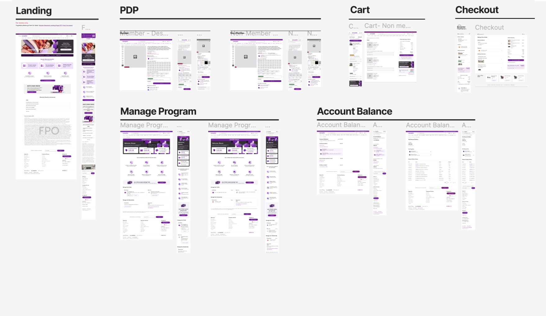
UX & Platform Design
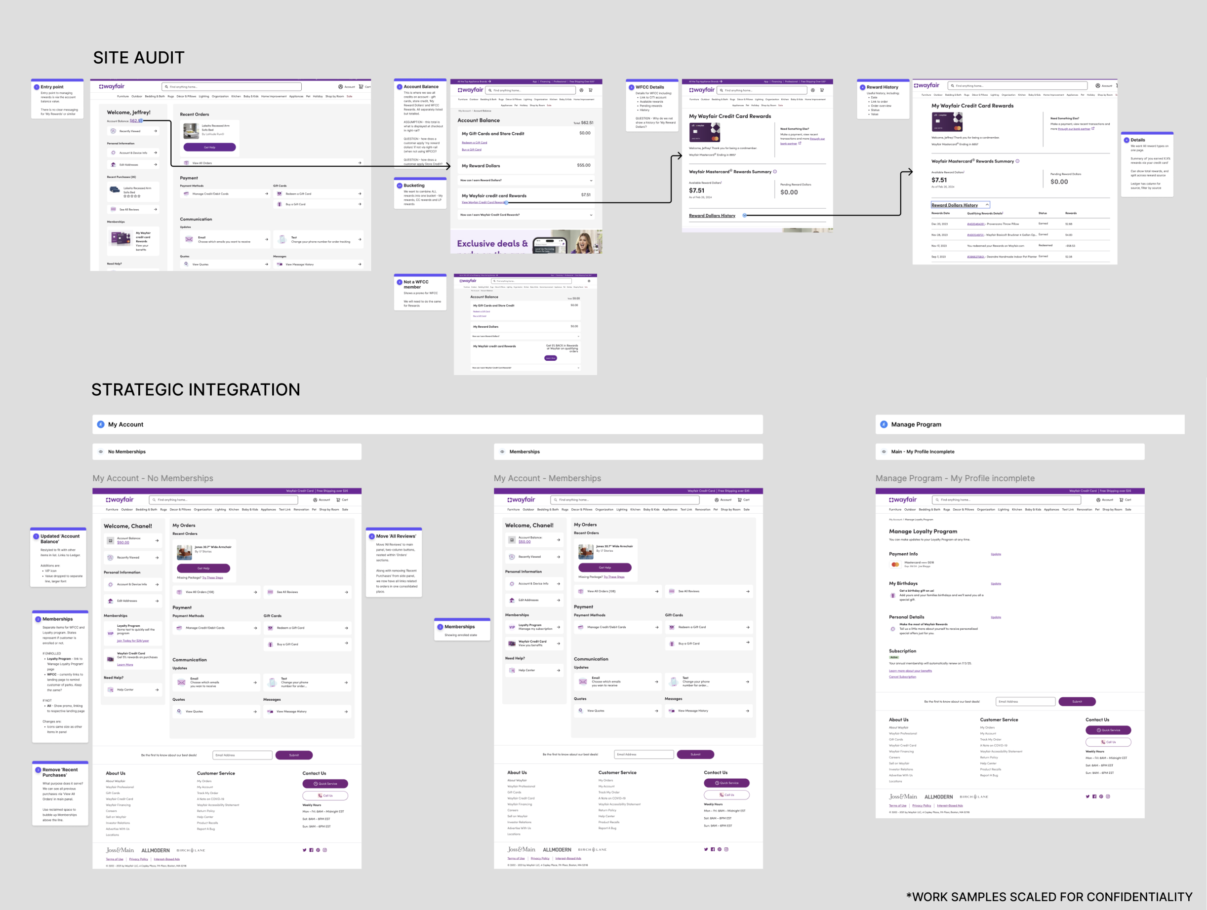
Platform Wireframes
Before a single pixel of final UI was designed, every screen was wireframed across desktop and mobile. Fidelity came second to flow, the goal was to pressure-test the member journey end to end before committing to visual execution.
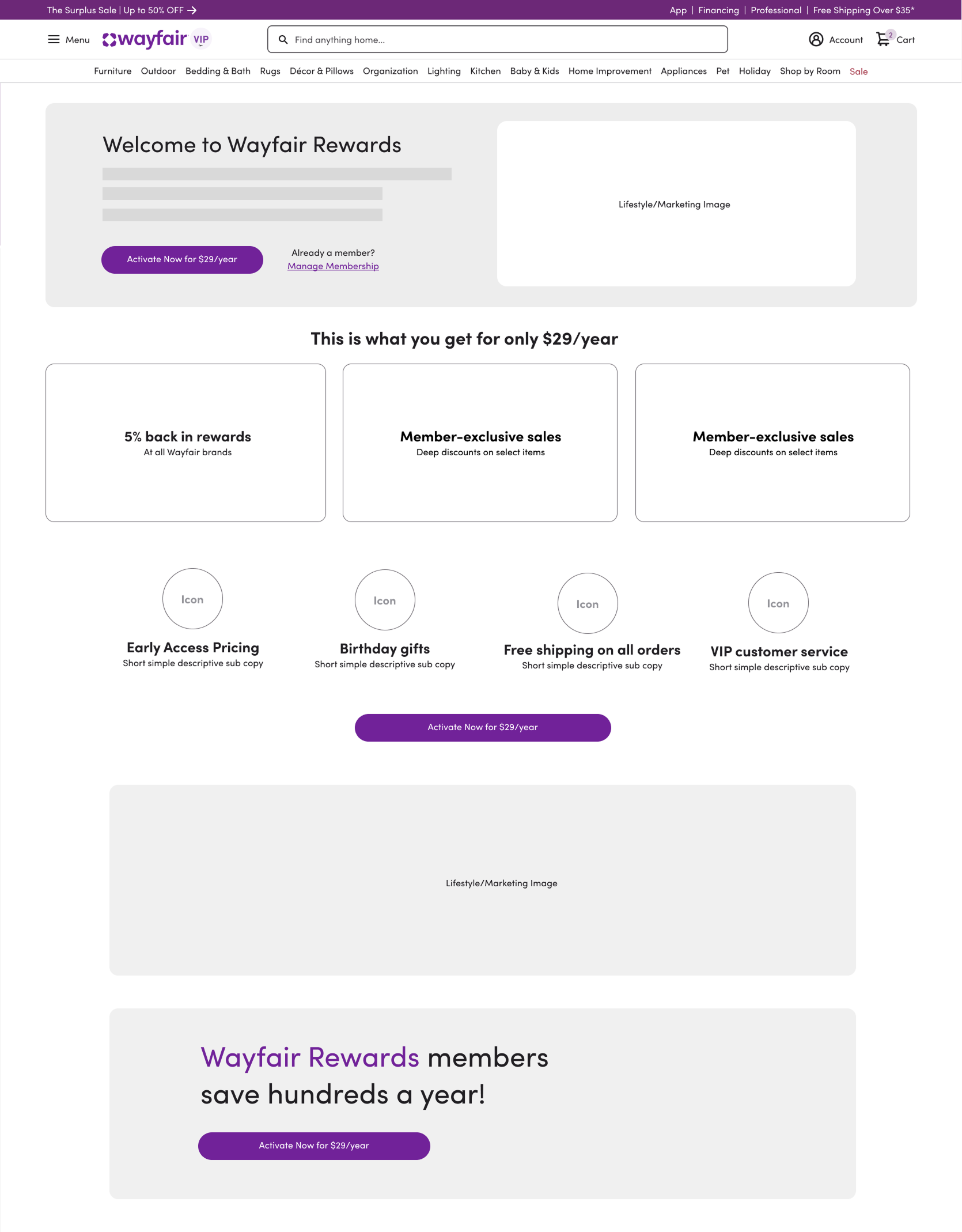
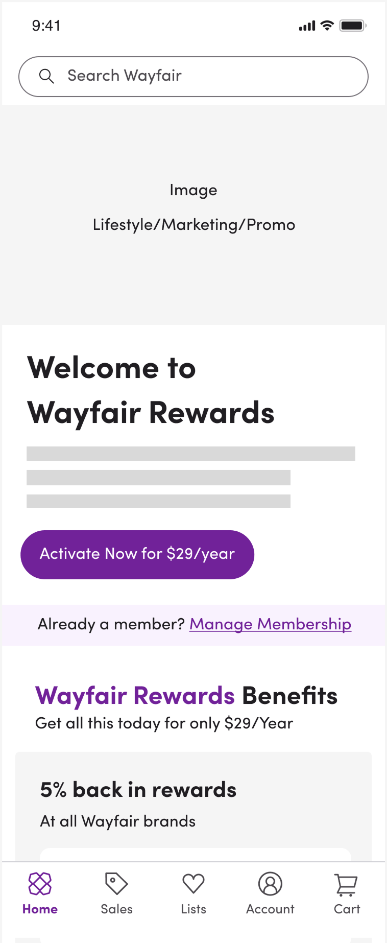
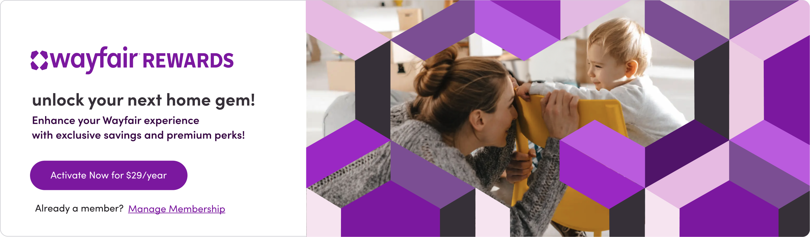
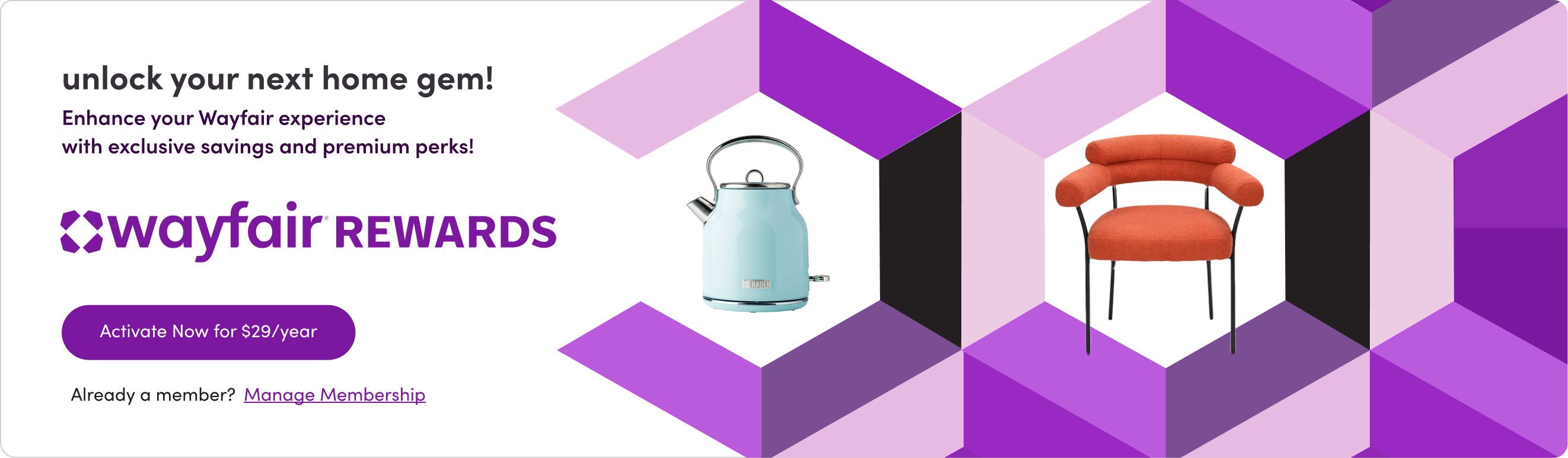
Landing Page Visual Direction
With the UX structure established, we explored how the Rewards brand would come to life on the primary acquisition surface. Three lifestyle directions were tested against the same layout, each pairing Wayfair's product photography with the geometric tile system from the brand identity. The goal was a landing page that felt like a premium membership offering without losing the warmth and approachability of the broader Wayfair brand.
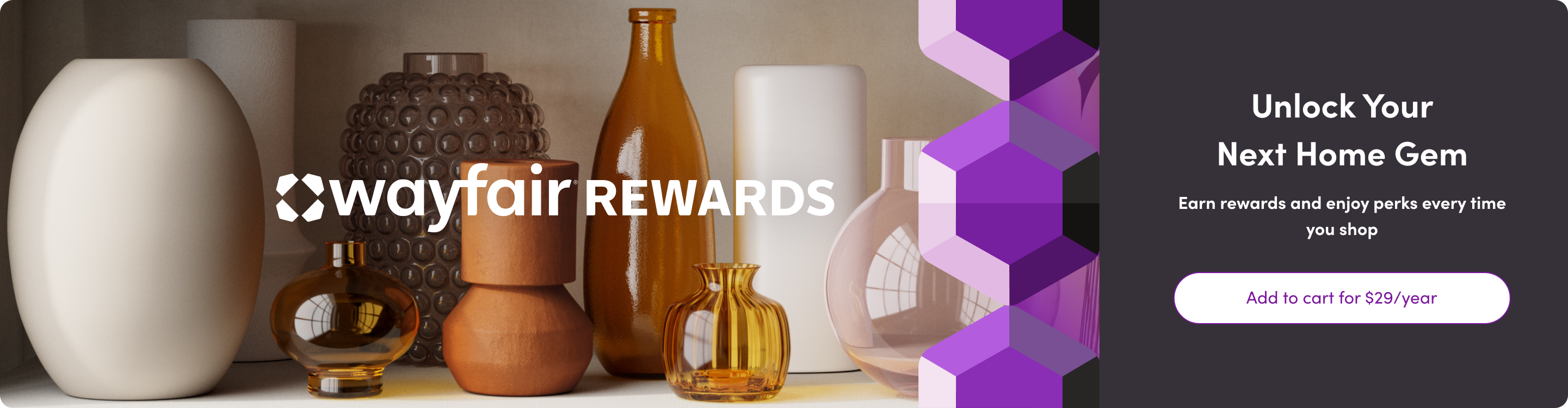
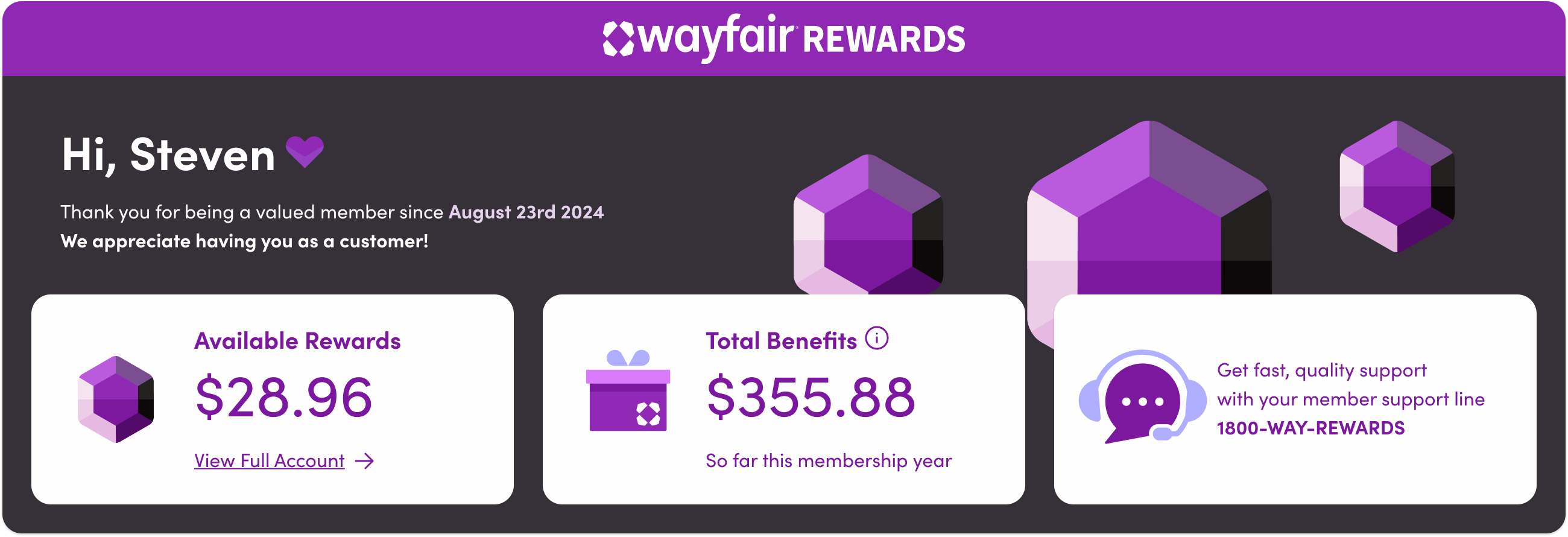
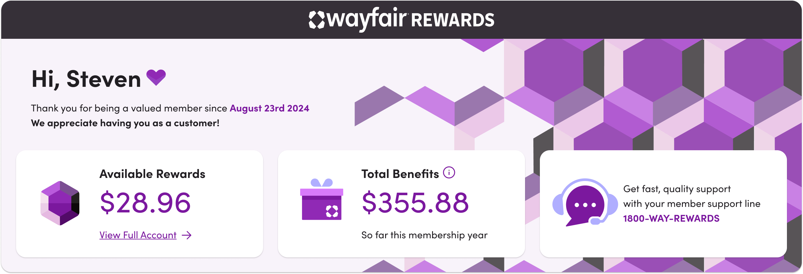
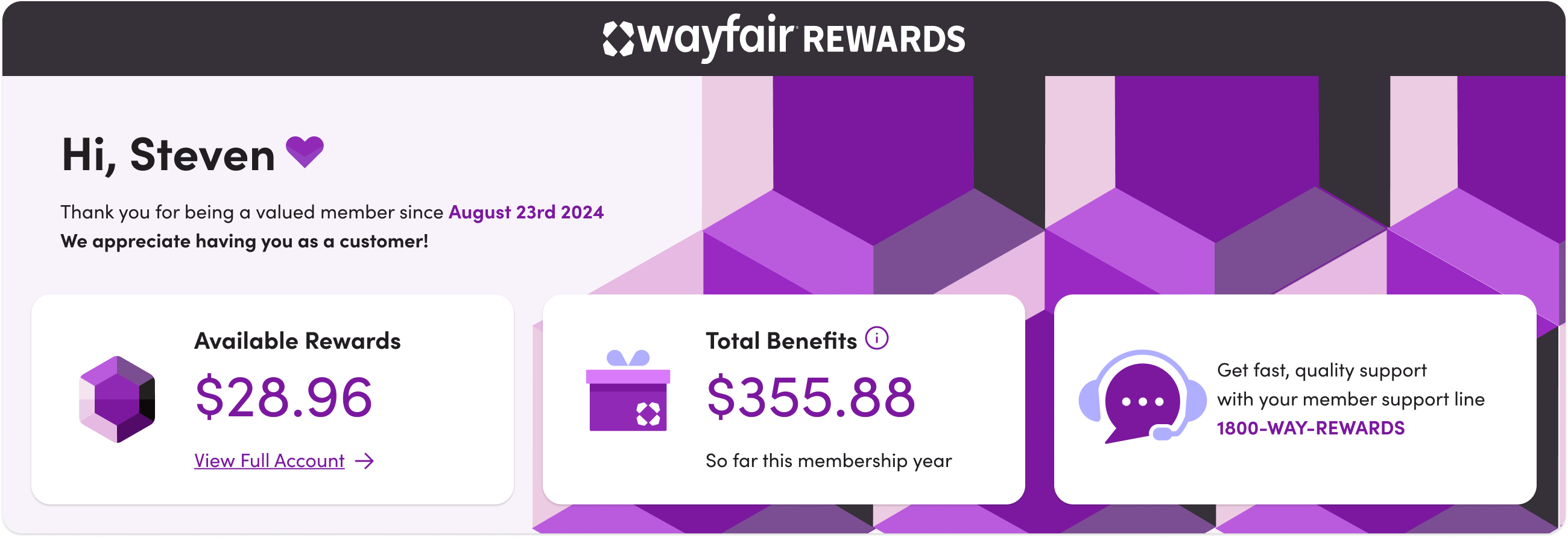
Dashboard Header Explorations
The member dashboard header was the most brand-expressive surface in the program. We explored three directions: a dark UI with dimensional GEM icons as the hero element, a lighter treatment with a geometric brand pattern, and a full-bleed purple tile system that pushed the brand further. Each direction was pressure-tested against legibility, personalization requirements, and how the header would scale across membership tiers.
End to End Site Strategy
Rewards wasn't a standalone feature. It touched every major surface on the Wayfair platform. The work spanned landing pages, product detail pages, cart, checkout, program management, and account balance -- each screen designed to surface membership value at the right moment in the customer journey.
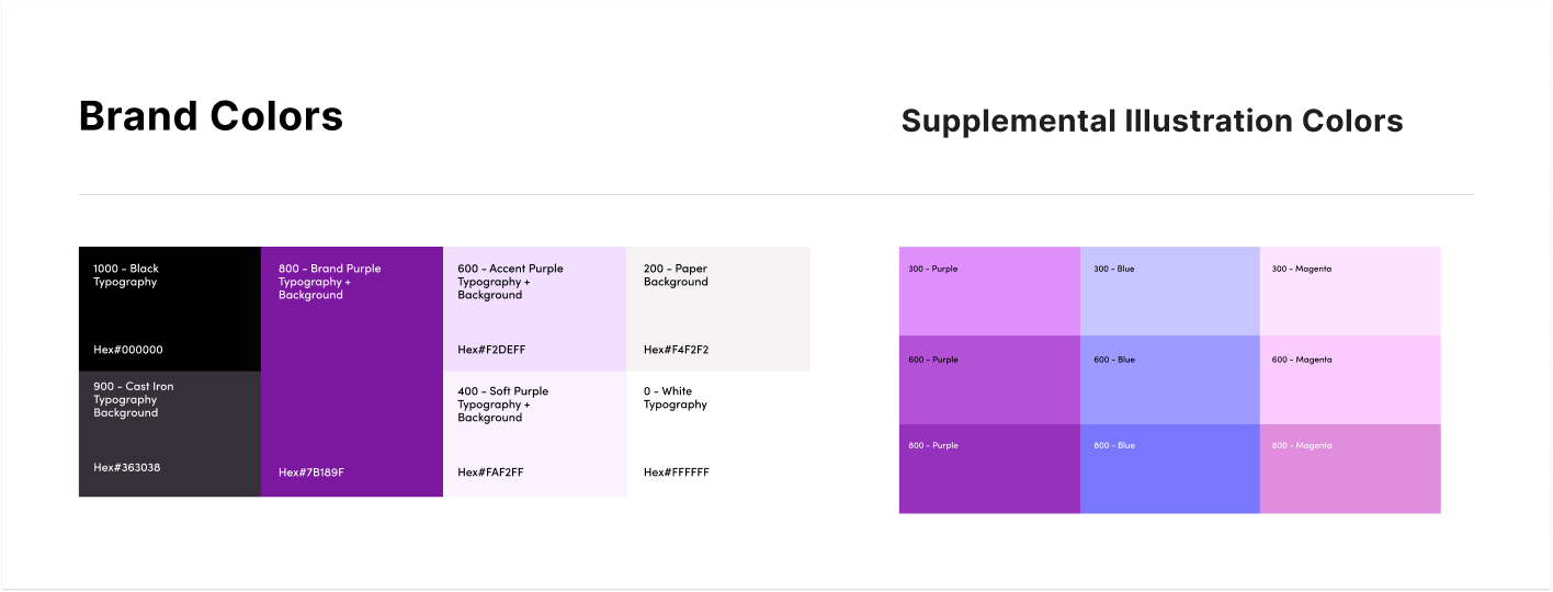
 Brand & Visual
A loyalty program lives or dies on perceived value. We built a visual language and identity system for Wayfair Rewards that felt premium without feeling out of place within the broader Wayfair brand. That meant establishing tier naming, tone of voice, and a merchandising system that could scale across every customer touchpoint.
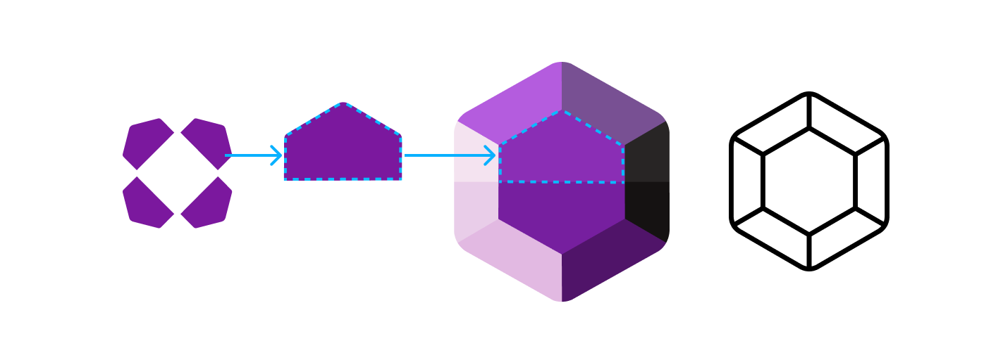
 Anatomy of the GEM brand mark
The GEM mark was derived directly from the Wayfair logo architecture. A single petal from the existing mark provided the base geometry. Rotated and faceted, it became a gemstone. A shape that communicates value, reward, and the thrill of finding something special.
 Brand Mark & Lockups
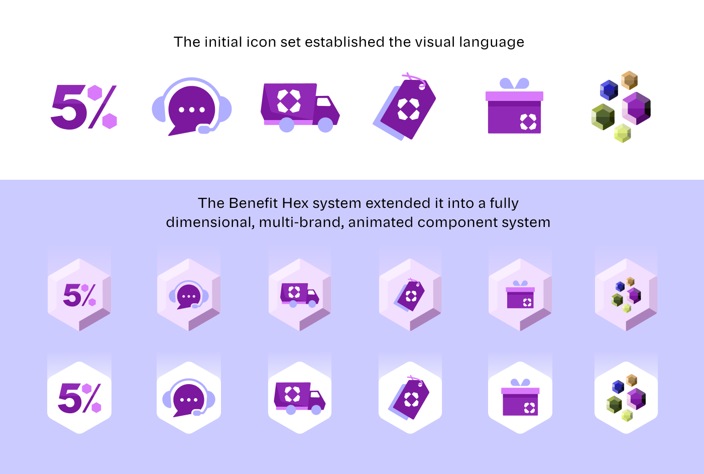
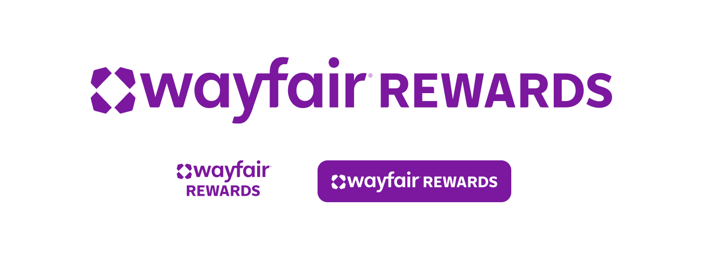 Icon System & Visual Language
The icon system was built to make every Rewards benefit instantly recognizable across the platform. Each icon was designed to carry the brand's visual language. Familiar enough to feel like Wayfair, distinct enough to signal Rewards membership.
Getting a program like this live required tight coordination across six teams. We ran a phased rollout, developed the member acquisition strategy, and supported go-to-market execution across engineering, marketing, and executive stakeholders simultaneously.
Desktop Landing Page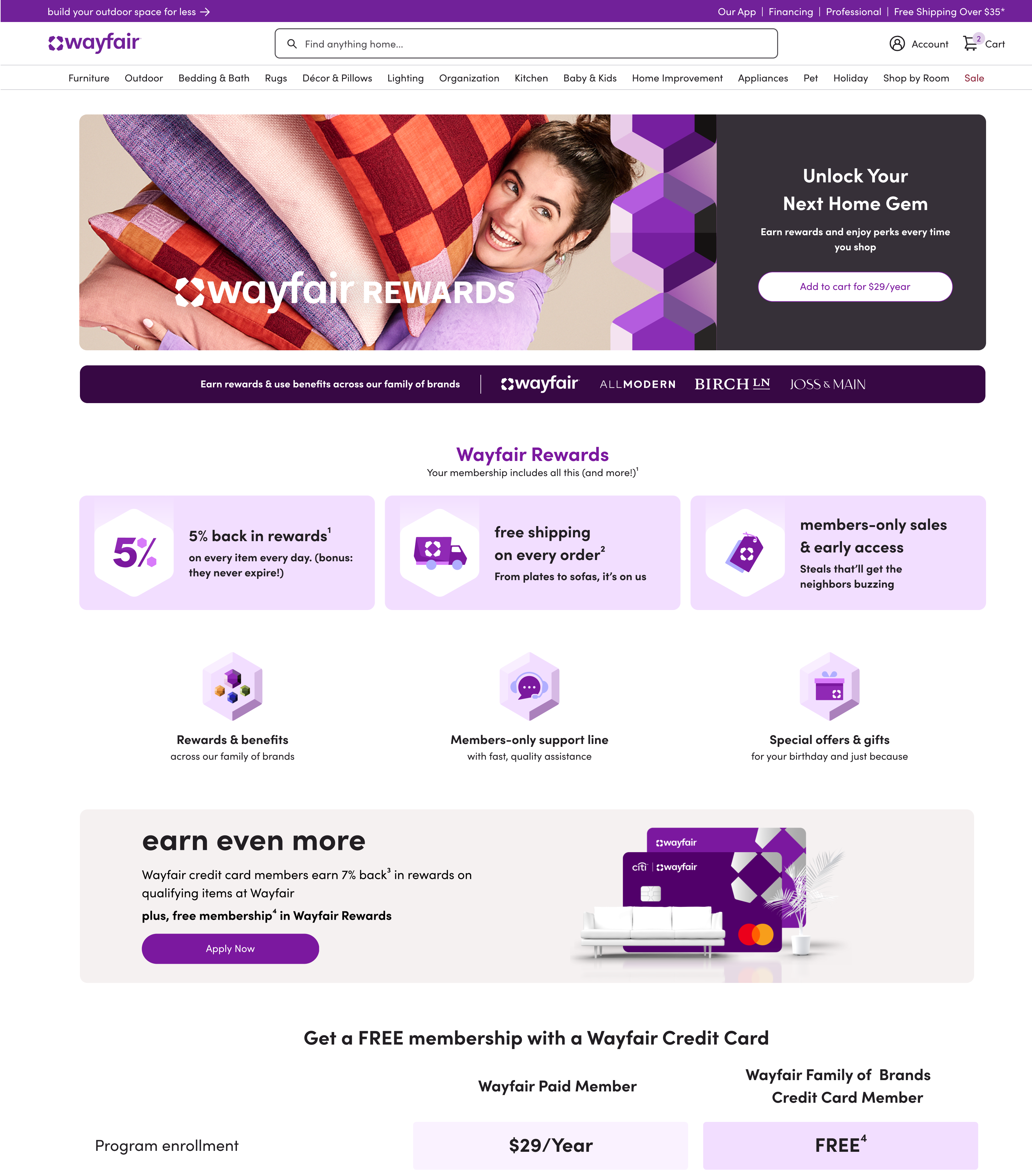 Mobile Landing Page
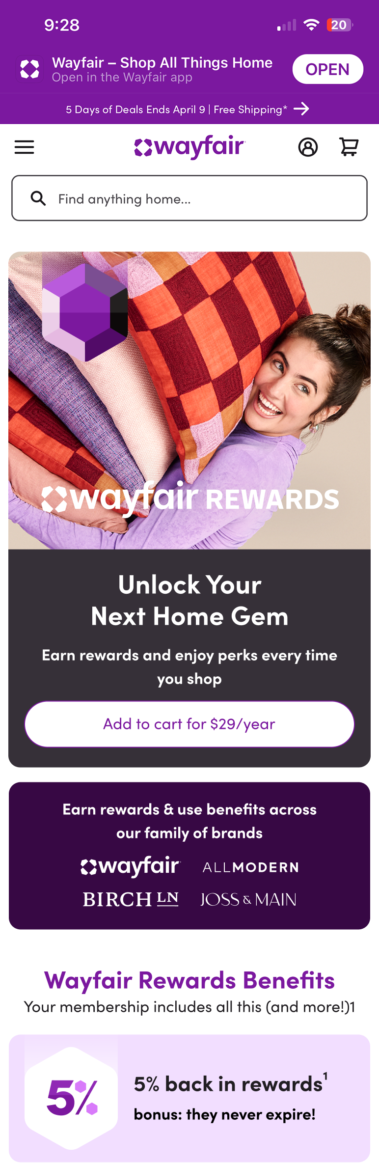 Desktop Manage Page
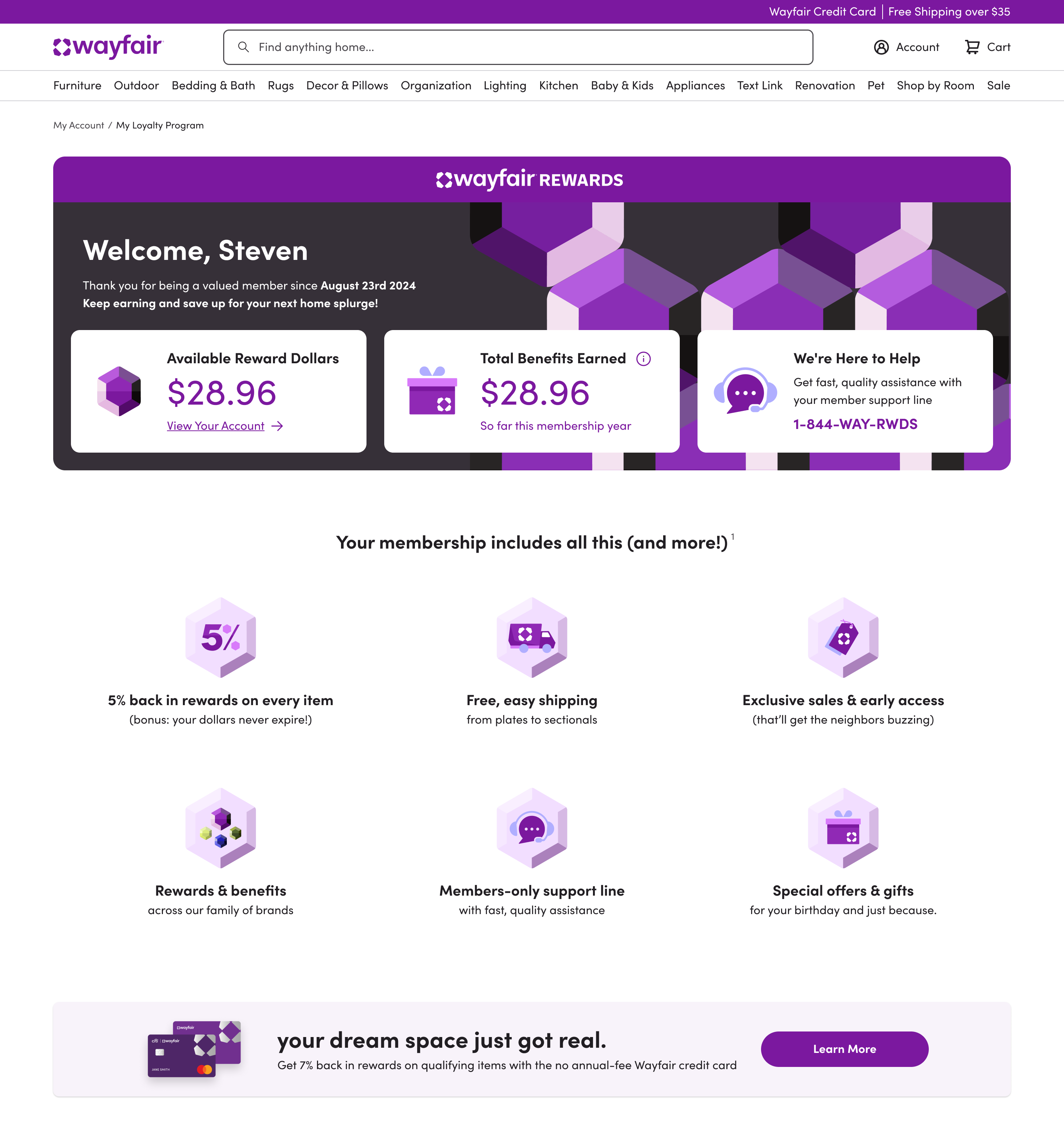 Mobile Manage Page
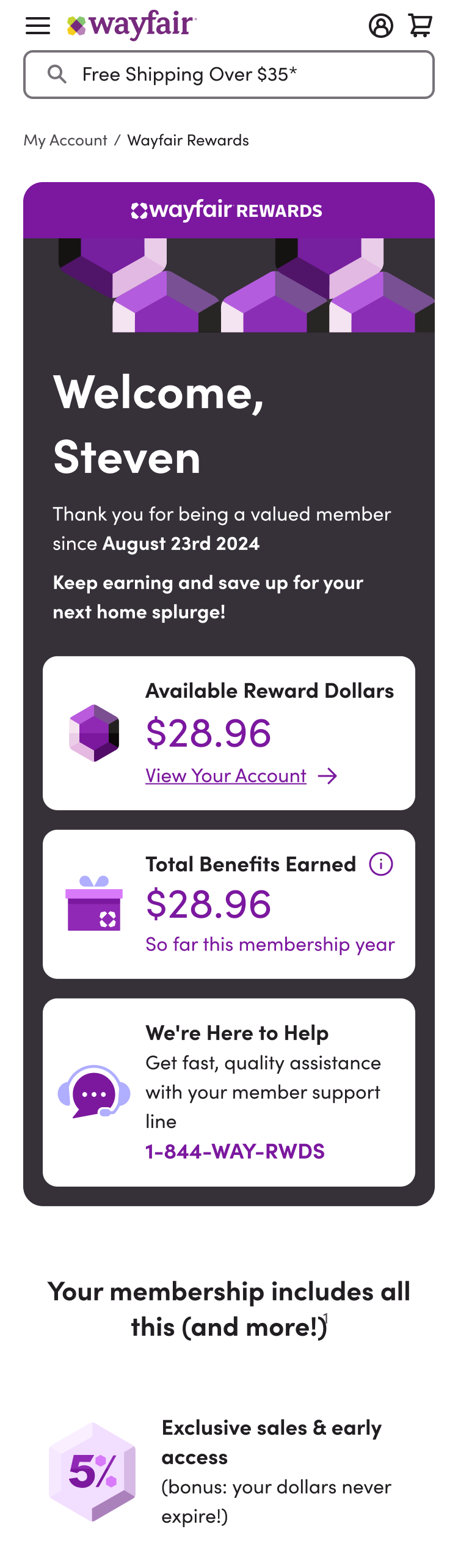
Wayfair Rewards launched in under six months. In year one the program acquired over a million members, drove more than 15% of U.S. revenue, and generated roughly 3x the spend among members compared to non-members. Post-launch we maintained feedback loops to keep iterating, because a loyalty program that stops improving stops being loyal.


